

Triplo: Mobile App Case Study
UX/UI Design
Timeline: 4 weeks (July 2023)
Tools: Figma, Adobe Photoshop, Miro
Role: User Research, User Interface Designer
PROJECT OVERVIEW
A brief introduction
Travel itinerary building can be frustrating due to poor organization, fragmented ideas of activities, and a lack of personalization. It can also be time-consuming and often lacks efficient methods of collaboration. Triplo aims to solve each of those pain points by providing its users with auto-generated itineraries based on preferences that can be collaboratively built upon with fellow tripmates.
Problem
People struggle to maintain organization and ease of accessibility when traveling in large groups.
solution
A travel itinerary app that brings friends, families, and groups together with centralized and collaborative itinerary building.
Design process
How it's done

I. empathize
A closer look into our users
In order to gain deeper insight into the needs, objectives, and challenges of our users, a user persona named Alex was developed for this brief.

II. define
Recognizing needs, goals, and pain points
Feeding off empathy for user personas like Alex, the designer can then establish a definitive necessity. A User Insight Statement is then developed to serve as a problem in need of direct resolution.
" Travelers face the challenge of inefficiently planning and collaboratively managing their trips due to the lack of user-friendly and comprehensive travel itinerary sources. "
III. ideate
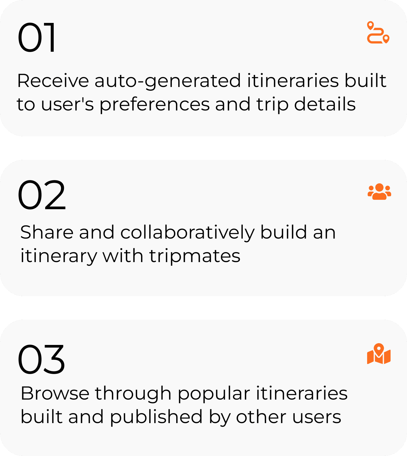
How Triplo elevates your exploration
The app's key features aim to provide convenience, connectivity, and a personalized experience for all travelers alike.
Iv. design
Building the Triplo experience
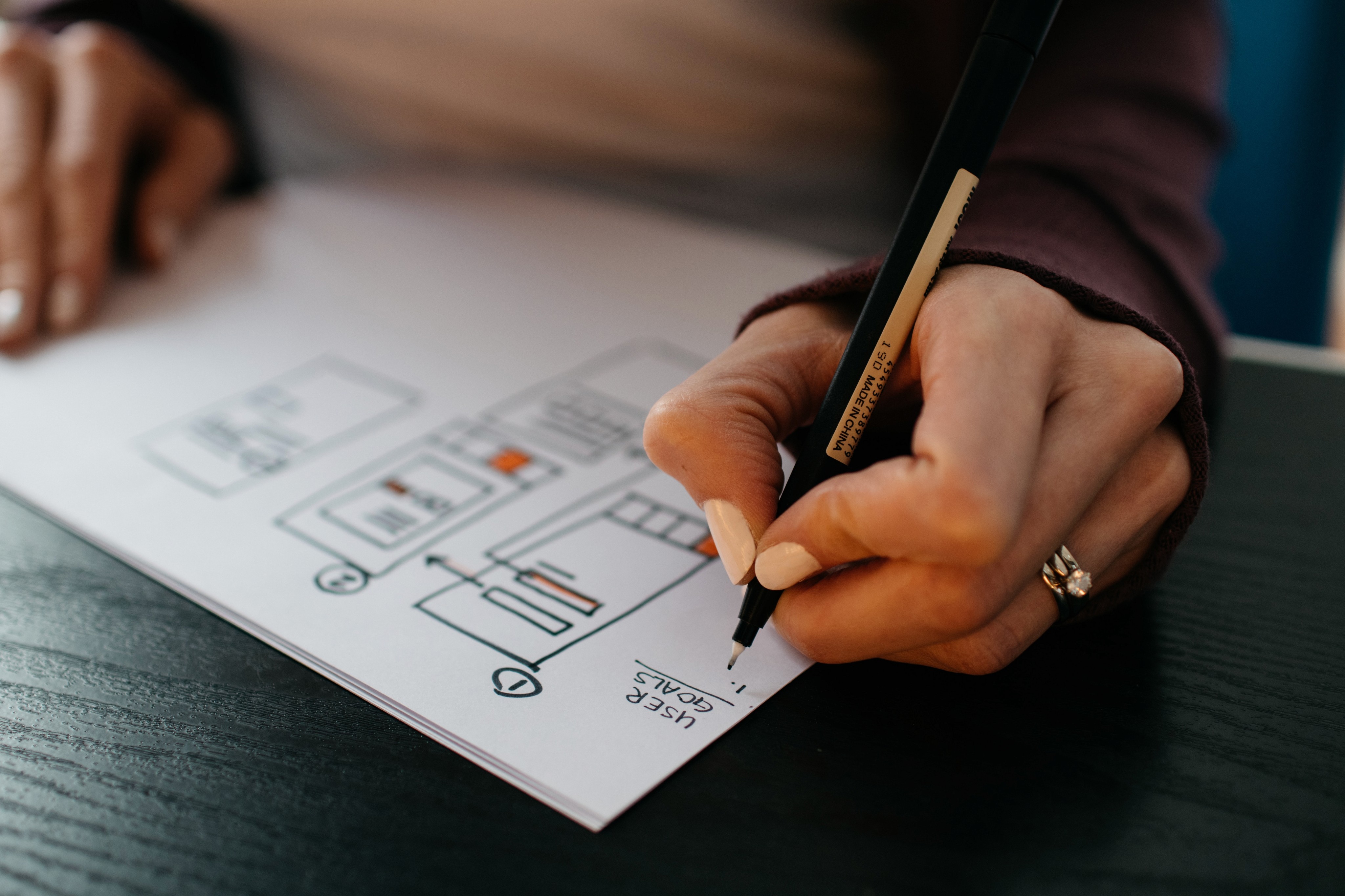
This next step of the design process required me to turn the design vision into a tangible reality. I started off with some rough sketches in order to get the ball rolling. Next came the user flow which gave me the foundation to prototype digital wireframes


visual direction
Bringing it all together
Before incorporating color, imagery, and typography, I developed a mood board to set Triplo's tone and refine the app's visual direction. Drawing from this mood board and adhering to visual design principles, I compiled a style guide centralizing each of the app's significant design elements.

Style guide


v. test
Ensuring Triplo's usability
A high-fidelity product doesn’t always mean a finished one. In order to refine the application, I conducted usability testing and user feedback sessions. This allowed me to identify and address usability issues for iterative improvements to create a more user-friendly and effective design.
testing plan
feedback
Validation
Users found the app's navigation easy to understand and follow
Testers appreciated the interactive onboarding tutorial, which effectively introduced key features without overwhelming them
Iteration opportunities
Users did, however, note that some texts/buttons were a bit small and hard to read from a distance which is something I anticipated having to reiterate
Testers did suggest that the application would greatly benefit from an auto-generative itinerary feature for those who don't have many travel preferences; a feature I would certainly consider implementing in a final iteration

key insights
Final thoughts & next steps
If there is one thing I learned, it's that in an ever-evolving technological landscape, the continued prioritization of user feedback and the integration of the latest design trends is vital in developing mobile applications. Likewise, data-driven decision-making, utilizing data analytics for insights into user behavior, is an invaluable asset in the design process. Triplo underwent various iterations throughout the testing phase, and I could certainly say that its usability couldn't have been as polished without the utilization of user testing and feedback.
I believe that with the necessary tools, resources, and a dedicated development team, Triplo has the potential to succeed as a mobile application. Just imagine how much easier travel planning could be!