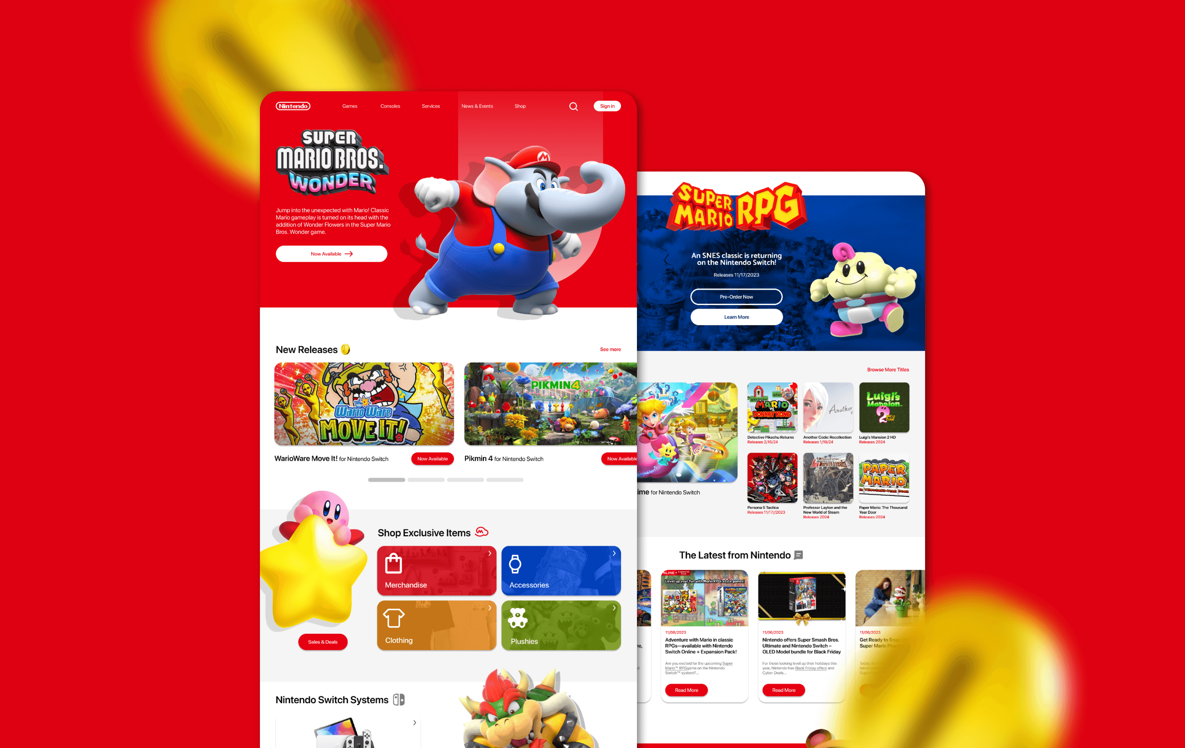
Landing Page Redesign: Nintendo
UX/UI Design
Timeline: 2 weeks (November 2023)
Tools: Figma, Adobe Photoshop
Role: User Experience Research, User Interface Design
why nintendo.com?
A project inspired by nostalgia
Growing up, I was an avid gamer who was highly captivated by vibrant colors and familiar characters. Although I couldn't make any purchases as a child, I spent plenty of time browsing through Nintendo.com just to look at games and consoles I was prepared to put on my Christmas wishlist. I was particularly drawn to its colorful nature which both supported Nintendo's brand identity and appealed to all of its fans.
Now, with my designer hat on, I understand that creating a compelling user experience tailored to visually captivating video game fans like myself is an effective way of designing a website for companies and organizations alike.
objective
Enhance user satisfaction by making it simpler and more intuitive for effortless navigation and engagement.
why a redesign?
As a business, Nintendo's goals would be to maximize their profits and expand their brand. In order to accomplish this, their user experience must be designed to optimize the tasks that allow the user to support those goals.
CURRENT
REDESIGN
Design process
How it's done
The Double Diamond design thinking process consists of four stages. It starts with exploring and understanding the problem space (Discover), narrowing down and defining the core issues (Define), ideating and generating diverse solutions (Develop), and finally refining and implementing the best ideas (Deliver). It's a flexible framework that encourages creativity, empathy, and iteration to arrive at innovative solutions that truly address user needs.
i. Discover
Understanding users
A good redesign starts with studying the current user experience of the site. Nielsen Norman's Hoa Loranger once said, "Your old site is the best prototype for your new site."
I conducted usability testing on the current Nintendo landing page to get some hard data to build upon. I tested a total of ten users between the ages of 16-24 with the objective of discovering any needs, challenges, or pain points.

testing plan
What do you expect to accomplish on this website?
Is the content on this page easy to understand?
Did you feel encouraged to take specific actions on the website?
My findings
Most users expressed that the landing page feels a bit flat; missing engaging animations and interactions
Some users were a bit confused by what My Nintendo Store had to offer
A few users expected to see more recently released games within the hero section
iI. Define
A simpler approach
The testing results indicate that the site could see some improvements in content clarity, visual engagement, and layout & organization. I believed that simplifying the site's interface, including 3D characters, and emhpasizing calls to action would be an effective solution. I analyzed competitors, such as Playstation and Xbox, to see what the UX strategy of their sites were characterized by.
competitor analysis


One strong commonality between these two landing pages is a full-screen hero section with a call to action. Offering few visual distractions, your attention is initially directed to the product displayed. This was a design choice I kept in mind moving forward.
iII. develop
Designing the blueprint
This next part of the design process allowed me to fully realize my vision into a product. With my user insights, I established a few key redesign principles and also developed my wireframe.
key changes
I opted to communicate section separations by having its background colors contrast as the user scrolls through
The My Nintendo Store section now has a shop by category browsing option
"Coming Soon," a chronological listing of new and upcoming titles to be released
An overall wider variety of layouts
iV. delivery
Nintendo.com reimagined
My personal favorite phase of the design process, high-fidelity prototyping! I was glad to be able to bring this design to life with color, imagery, and a handful of my favorite characters.


what's new?
Not exactly new, but a sweet little carousel
UX Insights
Reflection & future opportunities
A successful redesign of Nintendo.com's UX/UI is more than a visual overhaul; it's an opportunity to foster all fans and newcomers with a positive digital experience. One of my biggest obstacles while redesigning is when the current product is already a well-functional one. It truly requires you to challenge the design and think a bit more out of the box.
If I were to revisit this project in the future, I would love to:
Design and prototype secondary screens
Collaborate with some figma animation specialists to implement some motion graphics
Develop a responsive mobile breakpoint, possibly even a Nintendo mobile app


