
Loop: Mobile App Case Study
UX/UI Design
Timeline: 3 weeks (August 2023)
Tools: Figma, Adobe Photoshop, Miro, Google Forms
Team: Kyle Santos, Rachel Miller, Maisa Rahman
Role: User Experience Design, User Interface Design, Brand Design
PROJECT OVERVIEW
A little rundown
For this group project, my design team and I were tasked with developing a mobile app aimed at solving any day-to-day issue. With such a wide range of ideas to choose from, it felt like the opportunities for this project were endless. However, all being from highly-populated urban areas, we all came to agree that a parking reservation app would save each of us plenty of time and stress.
Problem
In urban areas, the increasing number of citizens and vehicles has led to a significant challenge in finding available parking spaces.
solution
Providing users with access to efficiently locate, reserve, and navigate available parking spaces in real-time, ensuring them convenience, accessibility, and a seamless parking experience.
Design process
Our methods

I. empathize
Putting ourselves in our users' shoes
A strong and functional design is always built upon empathy. To get started, we developed a proto-persona of a potential user, Jenna, to further understand our user's needs and challenges.

II. Define
What are we solving?
With Jenna's struggles identified, we shifted our focus to the entirety of our potential user base. A trend of common pain points & frustrations among people like Jenna set up for our Problem Statement.
"We believe providing access to real-time parking location, price, and availability for young adults frequenting urban areas will achieve less aggravation and time wasted looking for parking."
III. ideate
Brainstorming for solutions
No idea is a bad idea in the ideation process. As a design team, we allowed all ideas to flow freely in the hope of pinpointing problem-solving features. We started off by listing features we like about competitor apps (I Like), features we wished currently existed on competitor apps (I wish), and lastly our dream scenario of features (What If?). The two features highlighted by the eyes were ones that we were particularly fond of.


If we could implement every single listed feature we would, but in the early design process, we must narrow down our feature list to the most essential, effective, and easily implementable. In order to do so, we conducted a How-Now-Wow prioritization matrix. "How" are features that would be highly effective but a challenge to materialize, "Now" are common features that are readily applicable, and "Wow" are rather innovative features that could be smoothly implemented.
KEY features
The key features we decided to focus on, moving onto the design phase, were:
Reserving a parking spot in advance
Being able to compare prices across parking spots and locations
Iv. design
Navigating Loop
We wanted our app's functionality to be as straightforward as possible. If we designed a home page that was a navigatable map with a search bar, users would be conditioned to treat it like their Maps app, which is exactly what we intended. Likewise, they can view their active/future parking reservations and save their favorite parking spots for future use.
user flow

low-fidelity prototype
As you can see, the home screen is a scrollable map that displays the current user's location. From there, the user may browse within the area, or manually search up a location.

VISUal direction
Designing the brand identity
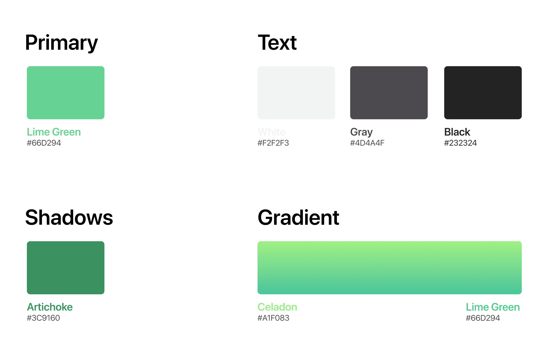
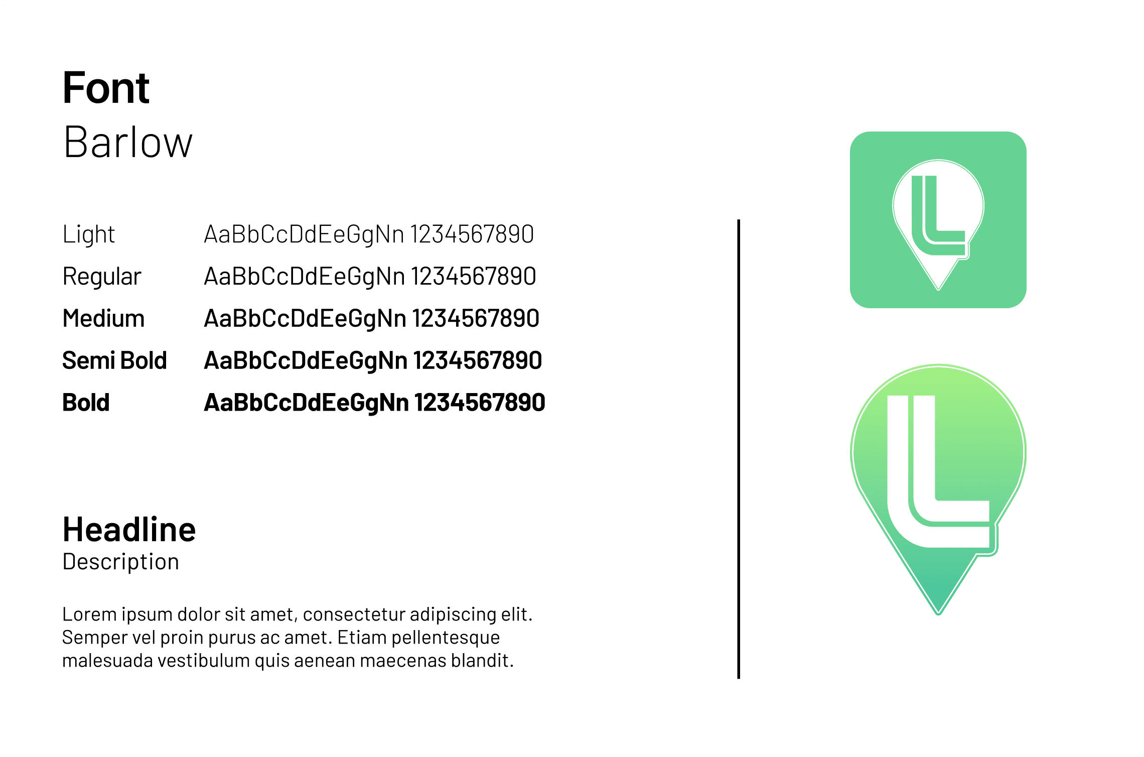
Our visual direction would be best described as simple, sleek, and lively. In the UX/UI world, the color green often symbolizes success and safety. We thought that lime green would represent our brand well and stand out amongst competitors. Additionally, I took on the role of designing our logo in Adobe Photoshop. I thought that a
style guide
High-fidelity prototype
Our visual direction would be best described as simple, sleek, and lively. In the UX/UI world, the color green often symbolizes success and safety. We thought that lime green would represent our brand well and stand out amongst competitors. Being the graphic designer on our team, I took on the role of designing our logo in Adobe Photoshop. I believed that implementing a location pin would communicate it being a parking space app well.


FLOw #1
flow #2
v. test
Validating our design

We had a short timeframe of 3 weeks to complete the project, so time was of the essence. Our design process was accelerated in order to reach a high-fidelity product within 2 weeks. Likewise, we had to ensure that, above all else, our product was user-friendly.
Our objectives were to:
Determine if testers can correctly assume how to proceed within a flow
Assess how intuitive the app is for users to navigate
See if users found the user interface visually pleasing and trustworthy
This was our testing approach:
Have the testers sign up and create a profile
Task the user with booking a parking reservation
hear from our testers


key insights
Interface Usability: Positive feedback on the ease of navigation, but some users struggled with specific features or screens.
Accessibility: Identified areas for improvement to ensure inclusivity for users with disabilities.
Reservation System: Generally successful in reserving spots, but occasional confusion with the "back" button
conclusion
Our final thoughts
Throughout this case study, we’ve all learned a lot from both a UX/UI researcher perspective as well as a user perspective. By providing an easy-to-use platform for users to find and reserve parking spots, Loop strives to improve the overall parking experience while potentially reducing traffic congestion. Both users/drivers and parking lot operators benefit from its features, which simplify parking and enhance management. Overall, we’re very proud to have presented this case study as we believe it demonstrates how technology can address urban challenges and make city life more convenient.