Signup Flow Redesign: Bleacher Report

UX/UI Design

Timeline: 2 weeks (October 2023)

Tools: Figma, Adobe Photoshop

Role: Usability Research, User Interface Design

PROJECT OVERVIEW

Designing the best first impression

The importance of a user-friendly signup serves as the digital gateway to an application’s world of services, products, and content. Essentially, it's the welcome mat and the foundation upon which user engagement and success are built within an app. As a frequent Bleacher Report user, I noticed a few UX flaws within its signup process, so I saw it as an opportunity to channel my design skills and recreate the flow.

objective

Redesign the sign up process to be more thorough and complete

CURRENT

REDESIGN

Design process

How it's done

The Double Diamond design thinking process consists of four stages. It starts with exploring and understanding the problem space (Discover), narrowing down and defining the core issues (Define), ideating and generating diverse solutions (Develop), and finally refining and implementing the best ideas (Deliver). It's a flexible framework that encourages creativity, empathy, and iteration to arrive at innovative solutions that truly address user needs.

I. discover

What's the current flow like?

I analyzed the current signup process and identified potential areas of improvement.

  • Lacks a brand identity within the interface

  • Prompts phone number signup over email signup; this may confuse users

  • No user authorization or clear privacy policy; users might be reluctant to sign up if they're not sure how their data will be used or protected

  • No coaching screens or feed personalization options

  • Feels a bit "flat" overall with lack of interaction and color

Ii. define

Metrics for success

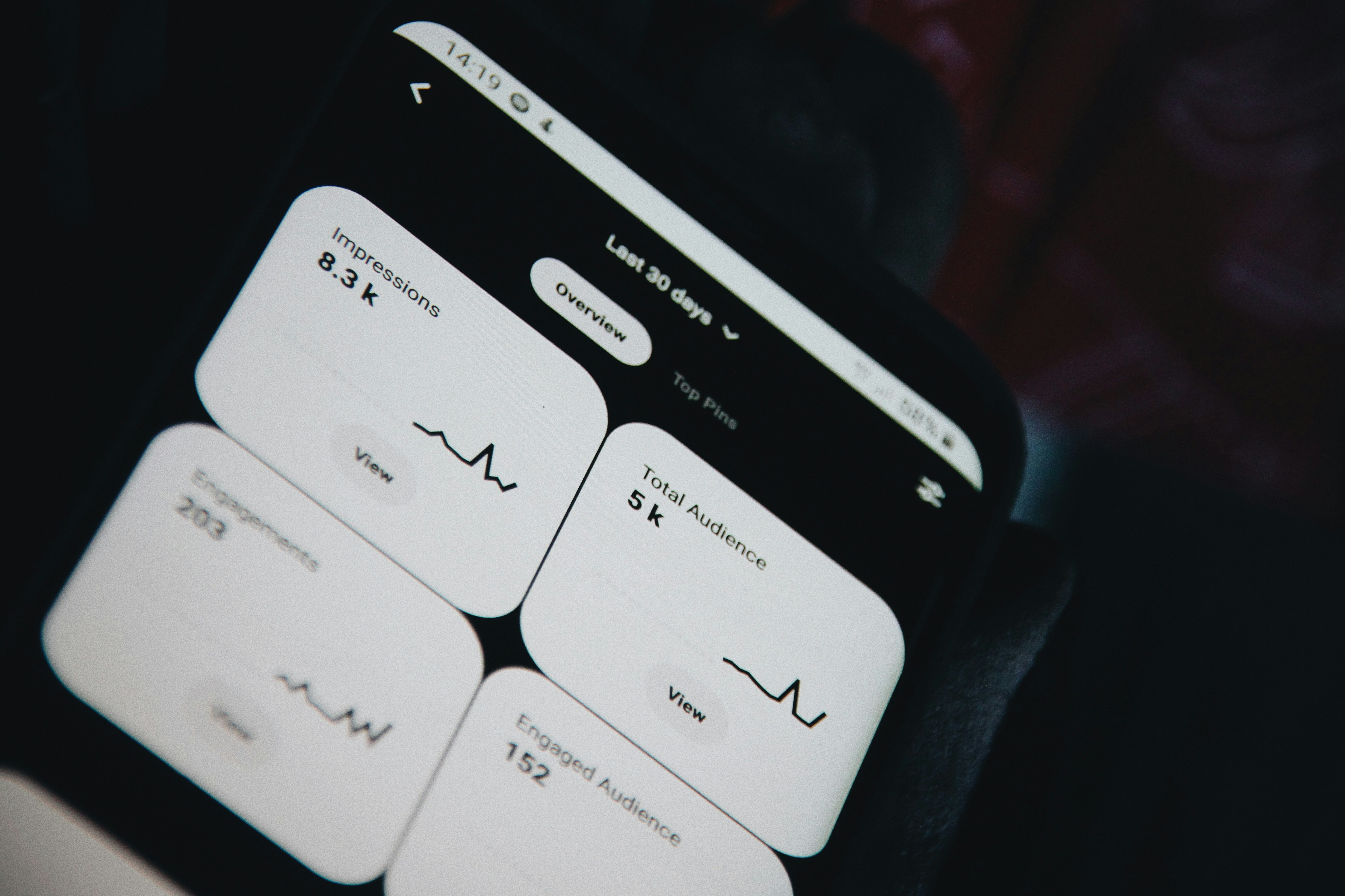
With the pain points identified, I shifted my focus to how I might measure success. This ultimately would serve as the definitive goal of the redesign.

goal

To increase the amount of users successfully signing up on the app

how i aimed to solve this

  • Condense all personal information, username, and email/phone onto one screen

  • Add user authentication prompt + terms of service agreement

  • "Follow your teams" screen for profile and feed personalization

  • Implement more color and subtle motion to create a stronger sense of brand identity

Iii. develop

Building it out

After defining my objectives, it was now time to build out the prototype. I started off with some sketches to get the ball rolling.

STYLE GUIDE

Bleacher Report's UI consists of a lime green secondary color which I felt was under-utilized in its interface. I decided to implement it to achieve a more lively look, along with how well it pairs with the primary color, black.

backgrounds

As I mentioned, I felt like the current interface was in need of some sort of motion or interaction to visually sustain user engagement. I also didn't want to create anything too distracting, so these were what I came up with. They're very subtle, so if you stare too long you might not see too much as is. But with components on top of them, they provide the perfect amount of depth to the interface.

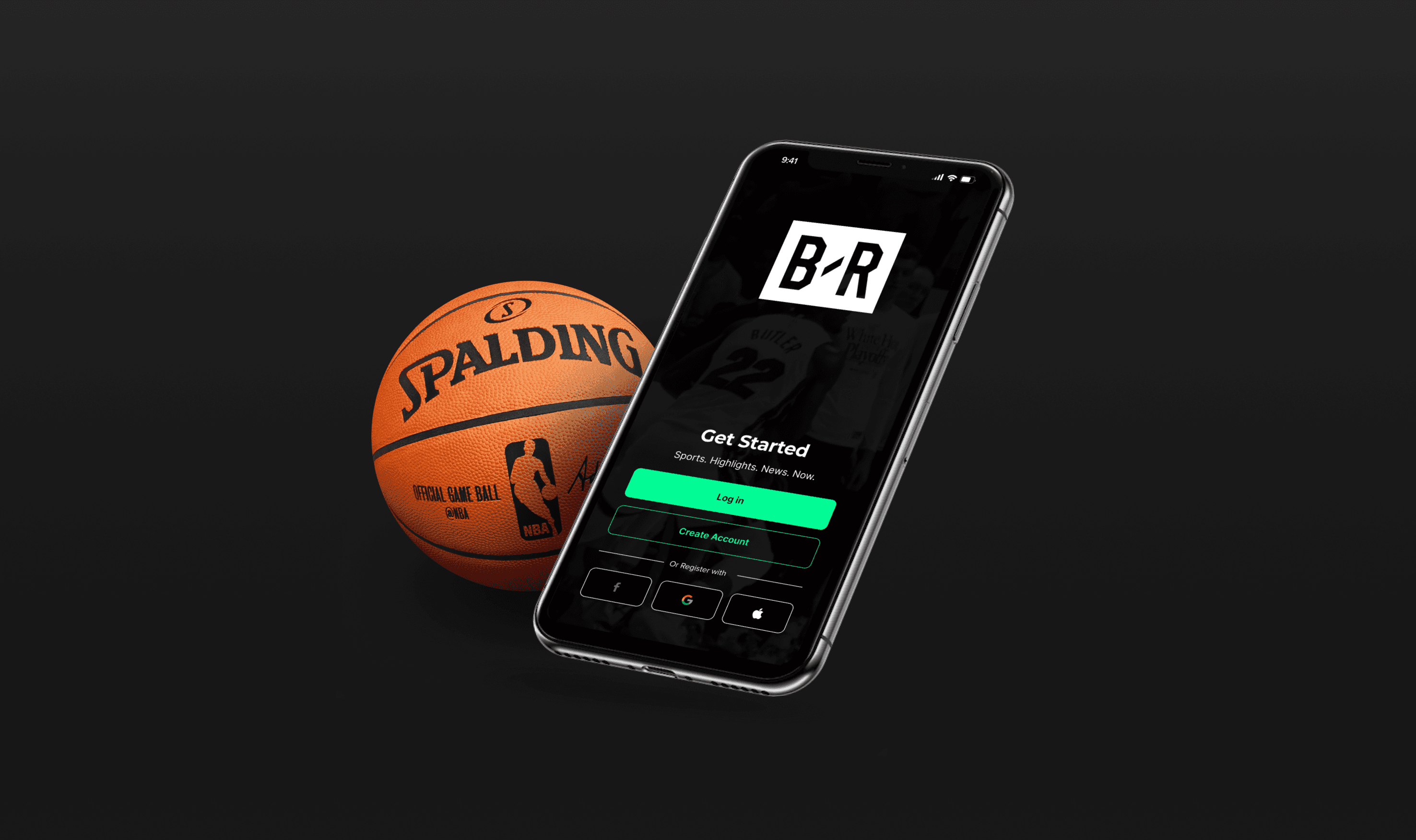
high-fidelity prototype

iv. delivery

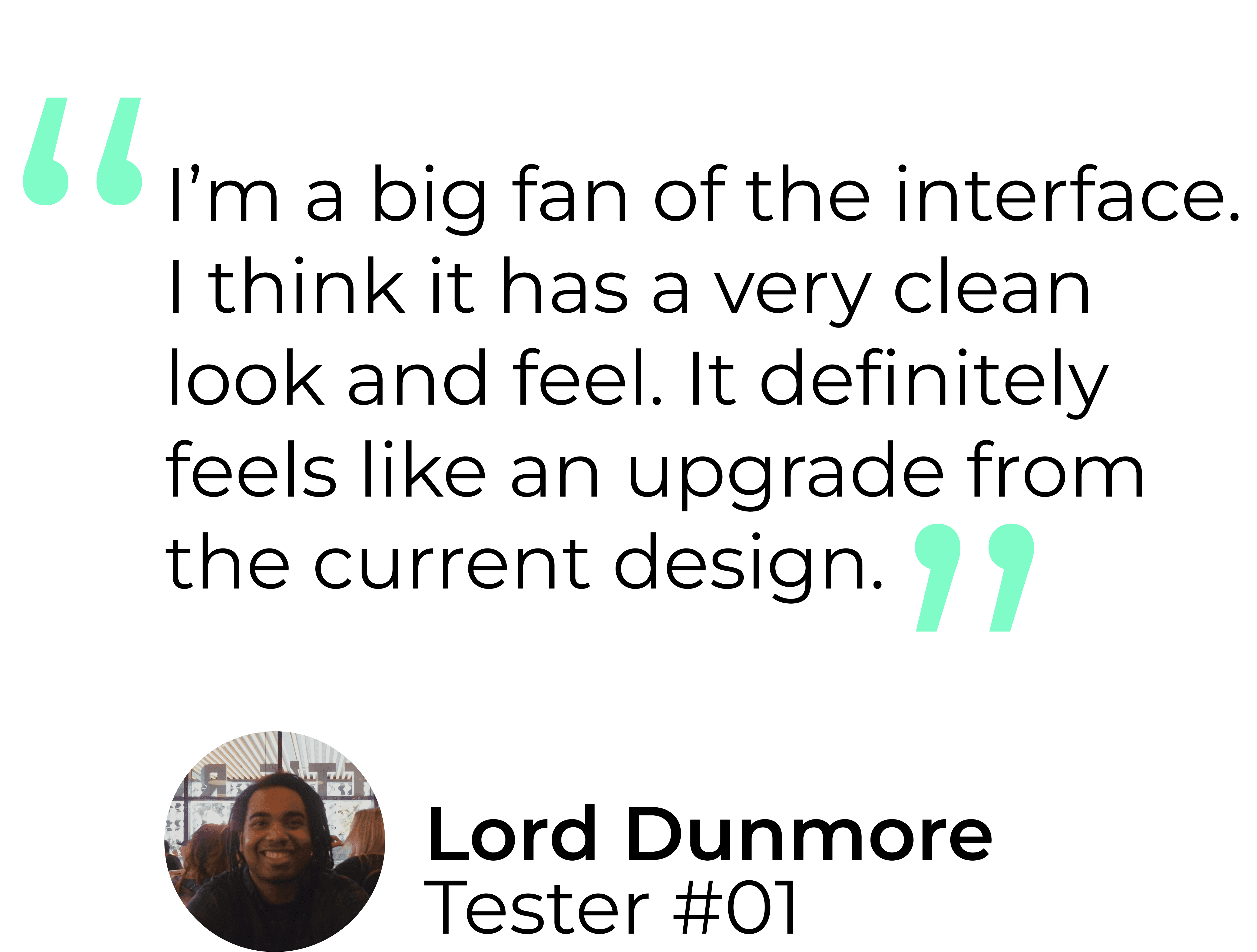
How was the design received?

In order to validate my design, I reached out to a total of twelve testers, between ages 18-28, who were avid users of sports apps.

usability testing

I tasked users with completing the signup process from start to finish. My objective was to discover any issues or confusion with the flow and receive general feedback. Here's some feedback I got:

KEY INSIGHTS

  • Ease of use: testers found the flow intuitive and straightforward with no confusion or hiccups

  • Visual appeal: feedback regarding the interface suggested that the redesign was more aesthetically pleasing

  • Content clarity: Testers could comment on whether they understood the required fields, the purpose of each step, or if any information seemed ambiguous.

suggestions for improvement

  • Progress indicators: implement progress indicators to show users where they are in the signup process

  • Accessibility: designing a day-mode version for users with disabilities, ensuring compatibility with assistive technologies.

  • Progress indicators: implement progress indicators to show users where they are in the signup process

  • Accessibility: designing a day-mode version for users with disabilities, ensuring compatibility with assistive technologies.

final thoughts

Project takeaways

Throughout the project, my focus revolved around comprehending users' needs and behaviors deeply. My aim wasn't just a functional signup flow; it was to craft an engaging, intuitive, and lasting experience that leaves a positive impression on our users. One challenge I had was finding a way to gain more introspective insight into my design. Since it was just a signup flow, there was only one task I could provide for the testers, but in the future, I would consider searching for methods that might result in more divergent feedback.

view protoype

Test it out yourself!